Diabetes, a chronic metabolic disorder, poses a substantial global health challenge. Accurate and timely prediction of diabetes onset is crucial for preventive interventions and personalized patient care. In this project, we will harness the potential of machine learning to develop predictive models capable of identifying patterns within a diabetes dataset. The choice of Logistic Regression and MLP as the algorithms for comparison is motivated by their distinct methodologies, allowing us to evaluate their respective strengths and weaknesses in handling complex medical data.
Throughout this project, we will outline the preprocessing steps, feature engineering, and model training processes for both Logistic Regression and MLP. The comparative analysis will not only shed light on their predictive capabilities but also offer insights into the interpretability and generalizability of each model. The ultimate goal is to equip practitioners and enthusiasts with a deeper understanding of the nuances involved in selecting the appropriate machine learning algorithm for diabetes prediction tasks.
-
Interpretability: Logistic Regression is generally more interpretable than complex models like MLP. The coefficients in Logistic Regression directly correspond to the impact of each feature on the output, providing a clear understanding of the model's decision process. MLP, being a neural network with multiple layers, can be more challenging to interpret due to its intricate architecture.
Interpretability helps you see the impact of each piece of information on the model's output. For instance, if a model predicts loan approval, interpretability shows you how factors like income, credit score, and debt influence the decision. -
Generalizability: The generalizability of the models will be assessed based on their performance on unseen data. A model that can generalize well to new diabetes cases beyond the training dataset is preferable, as it indicates the ability to capture underlying patterns common to different instances of the problem. The comparison between Logistic Regression and MLP will help evaluate which model is more effective in terms of generalization for the given diabetes dataset.
This practice project aims to explore predictive analytics using a diabetes dataset, employing two distinct algorithms for comparison – Logistic Regression and Multi-Layer Perceptron (MLP).
Diabetes Prediction
Let’s start writing practice project in jupyter notebook. I am using pima-indians-diabetes-database
github Diabetes-Prediction.ipynb
pip install -r requirements.txt
This command reads the requirements.txt file and installs all the specified dependencies.
Make sure you have Python and pip installed on your system, and the pip executable is added to your system's PATH.
import numpy as np
import pandas as pd
import seaborn as sns
import matplotlib.pyplot as plt
from scipy import stats

from sklearn.preprocessing import StandardScaler
from sklearn.linear_model import LogisticRegression
from sklearn.model_selection import train_test_split
from sklearn.metrics import classification_report
from sklearn.metrics import confusion_matrix
from sklearn.metrics import precision_recall_curve, auc, precision_score, recall_score, roc_curve, roc_auc_score

import tensorflow as tf
Reading dataset from the local file.
diabetes_DS = pd.read_csv('data/diabetes.csv')
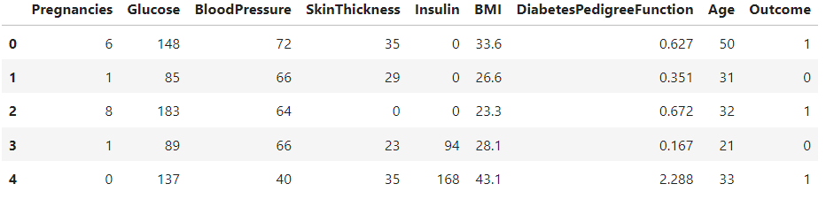
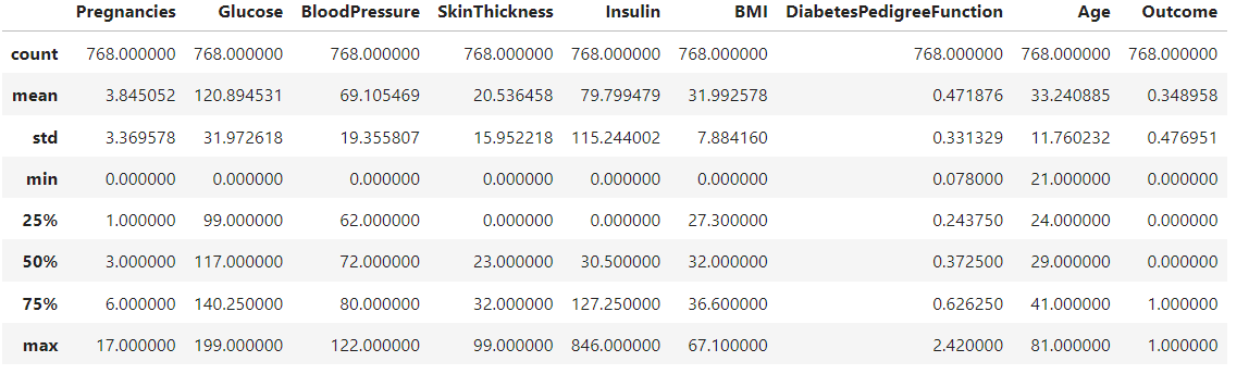
Now, Displays the first few rows of the dataset, statistical summary, shape (number of rows and columns), and the count of different classes in the Outcome column (0 - Non-Diabetic, 1 - Diabetic).
diabetes_DS.head()
diabetes_DS.describe()
diabetes_DS.shape
(768, 9)
diabetes_DS['Outcome'].value_counts()
Outcome
0 500
1 268
0 - Non-Diabetic
1 - Diabetic
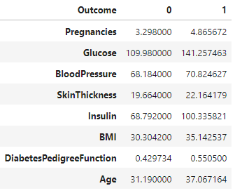
The provided code uses the groupby function to group a DataFrame named diabetes_DS by the 'Outcome' column, calculates the mean for each group, and transposes the result. The resulting DataFrame df contains columns for 'Outcome' 0 and 1, with rows representing mean values for each original column in the dataset.
df = diabetes_DS.groupby('Outcome').mean().T
df
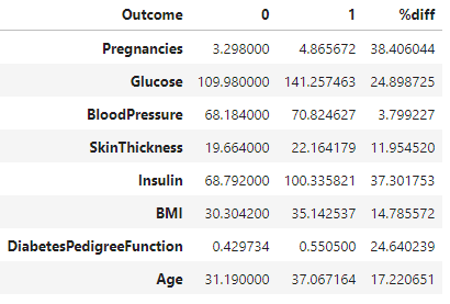
This formula calculates the percentage difference between values in columns labeled 0 and 1 in the DataFrame 'df'. The result is then stored in a new column labeled '%diff'. This formula is commonly used to measure the relative difference between two values.
df['%diff'] = (abs(df[0] - df[1] )/ ((df[0] + df[1])/2)) *100
df
Dropping the column named 'Outcome' from the DataFrame diabetes_DS.
data = diabetes_DS.drop(columns= 'Outcome', axis=1)
data.head()
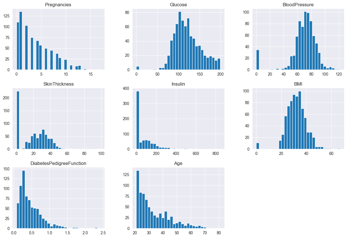
data.hist(bins=30, figsize=(15,10))
plt.show()
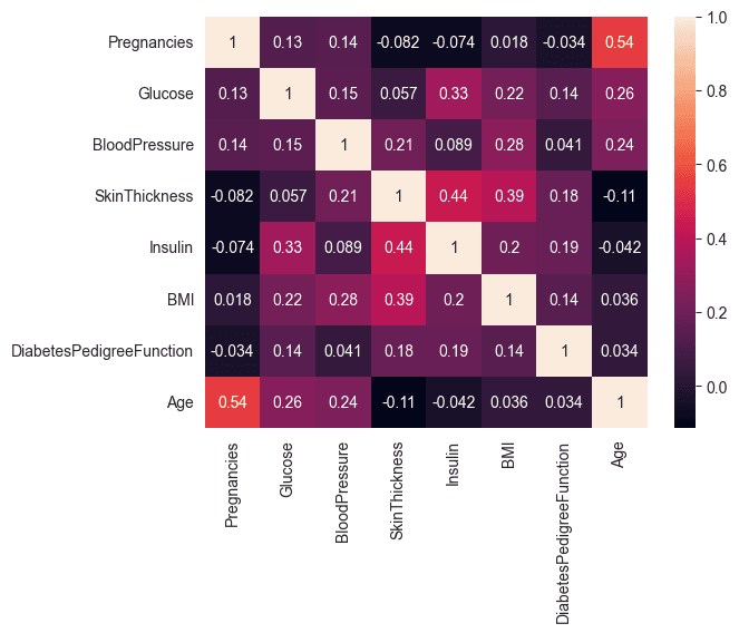
Computes the correlation matrix for the features in the dataset and visualizes it using a heatmap. This helps to identify relationships between different features.
corr_matrix = data.corr()
corr_matrix
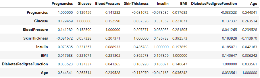
A correlation coefficient of 0.54, representing the maximum correlation between the variables "Pregnancies" and "Age," is considered moderate. This moderate correlation does not raise concerns.
sns.heatmap(corr_matrix, annot= True)
Preprocessing
performing imputation for missing values in specific columns of the diabetes dataset using the median value of each respective column.
# Calculate the median value for BMI
median_bmi = diabetes_DS['BMI'].median()
# Substitute it in the BMI column of the
# dataset where values are 0
diabetes_DS['BMI'] = diabetes_DS['BMI'].replace(
    to_replace=np.nan, value=median_bmi)

median_bloodp = diabetes_DS['BloodPressure'].median()
# Substitute it in the BloodP column of the
# dataset where values are 0
diabetes_DS['BloodPressure'] = diabetes_DS['BloodPressure'].replace(
    to_replace=np.nan, value=median_bloodp)

# Calculate the median value for PlGlcConc
median_plglcconc = diabetes_DS['Glucose'].median()
# Substitute it in the PlGlcConc column of the
# dataset where values are 0
diabetes_DS['Glucose'] = diabetes_DS['Glucose'].replace(
    to_replace=np.nan, value=median_plglcconc)

# Calculate the median value for SkinThick
median_skinthick = diabetes_DS['SkinThickness'].median()
# Substitute it in the SkinThick column of the
# dataset where values are 0
diabetes_DS['SkinThickness'] = diabetes_DS['SkinThickness'].replace(
    to_replace=np.nan, value=median_skinthick)

# Calculate the median value for SkinThick
median_skinthick = diabetes_DS['Insulin'].median()
# Substitute it in the SkinThick column of the
# dataset where values are 0
diabetes_DS['Insulin'] = diabetes_DS['Insulin'].replace(
    to_replace=np.nan, value=median_skinthick)
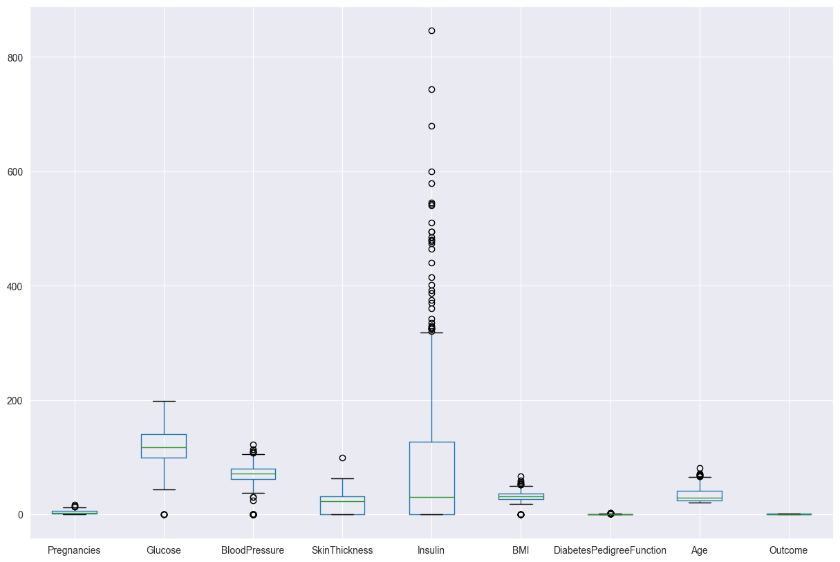
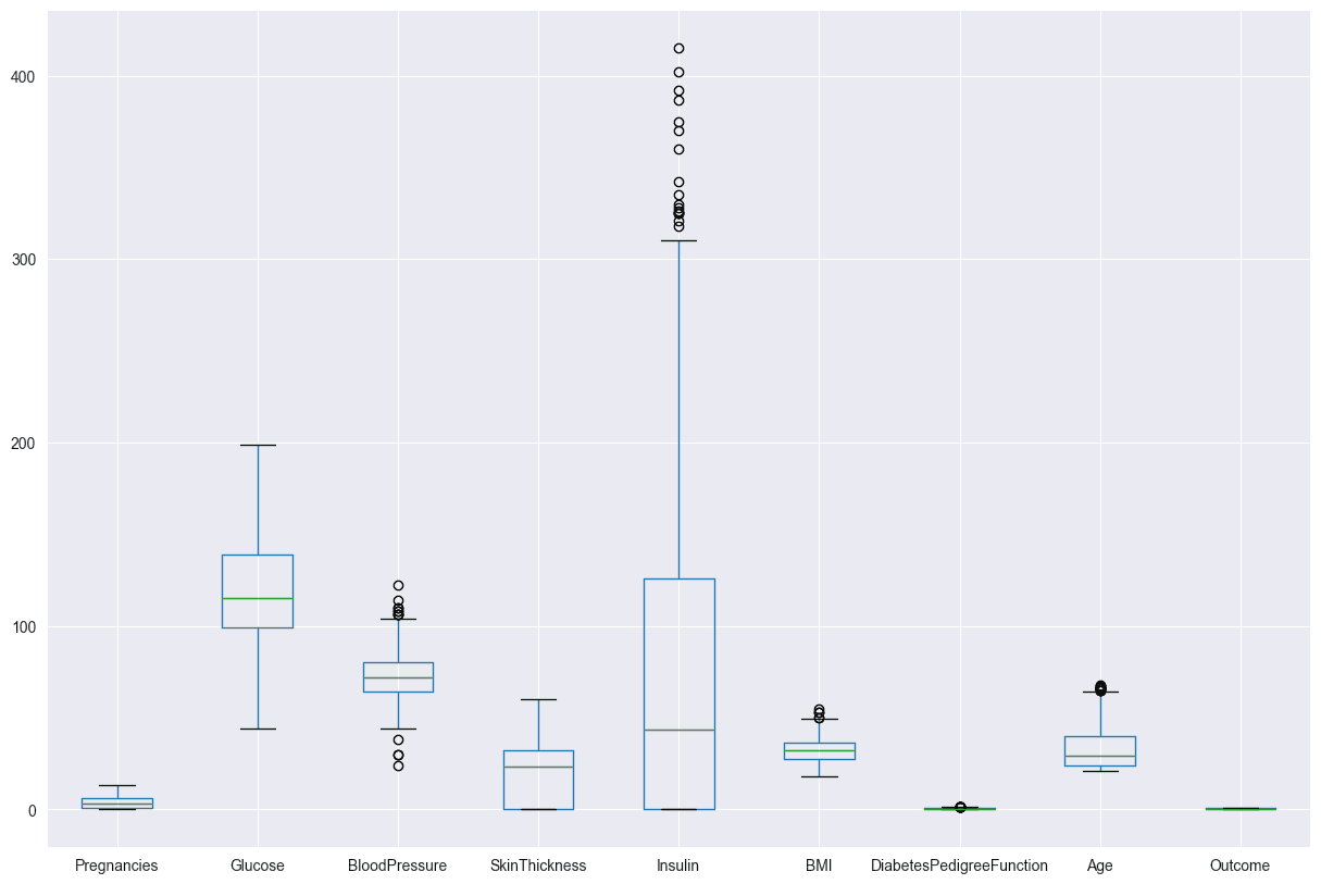
Use Z-scores to identify and filter out the outliers. The boxen plot for Insulin shows that the data is skewed, with a long tail of high values. This means that there are a few people with very high Insulin levels, which could be due to outliers or a different population.
diabetes_DS.boxplot(figsize=(15,10))
-
- is the z-score, a standardized value that tells you how many standard deviations a particular data point is from the mean
- is the raw score or data point you're interested in.
- is the mean of the data set, which is the average value.
- is the standard deviation, a measure of how spread out the values in a data set are.
- If the Z-score is positive, the data point is above the mean.
- If the Z-score is negative, the data point is below the mean.
- A Z-score of 0 indicates that the data point's value is exactly at the mean.
- By setting a threshold for Z-scores, you can identify and potentially remove data points that deviate significantly from the mean, helping to detect outliers in the dataset. The threshold value of 3 is a common choice, considering that data points beyond three standard deviations from the mean are considered unusual in a normal distribution. Adjusting the threshold allows for more or fewer data points to be flagged as outliers.
- Applies the .all(axis=1) operation along axis 1, which corresponds to the columns in the boolean array. This operation checks if all conditions are True for each row. The result is a boolean mask indicating whether all Z-scores for each data point are below the threshold.
# Define a threshold for the Z-score
z_threshold = 3
# Calculate the Z-scores for each column
z_scores = stats.zscore(diabetes_DS)

# Create a boolean mask for outliers
outlier_mask = (abs(z_scores) < z_threshold).all(axis=1)

# Filter the dataset to remove outliers
diabetes_DS2 = diabetes_DS[outlier_mask]

# Print information about the removed outliers
outliers_removed = diabetes_DS.shape[0] - diabetes_DS2.shape[0]
print(f"Number of outliers removed: {outliers_removed}")
Number of outliers removed: 80
After z
Feature Engineering
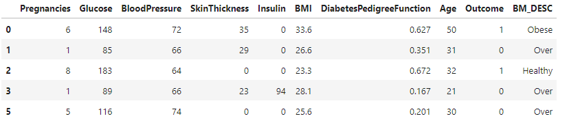
Categorizing BMI values into four groups (Underweight, Healthy, Overweight, and Obese). It then applies this function to each row of a DataFrame diabetes_DS2, creating a new column 'BM_DESC' to store the BMI descriptions.
def set_bmi(row):
    if row["BMI"] < 18.5:
        return "Under"
    elif row["BMI"] >= 18.5 and row["BMI"] <= 24.9:
        return "Healthy"
    elif row["BMI"] >= 25 and row["BMI"] <= 29.9:
        return "Over"
    elif row["BMI"] >= 30:
        return "Obese"

diabetes_DS2 = diabetes_DS2.assign(BM_DESC=diabetes_DS2.apply(set_bmi, axis=1))

diabetes_DS2.head()
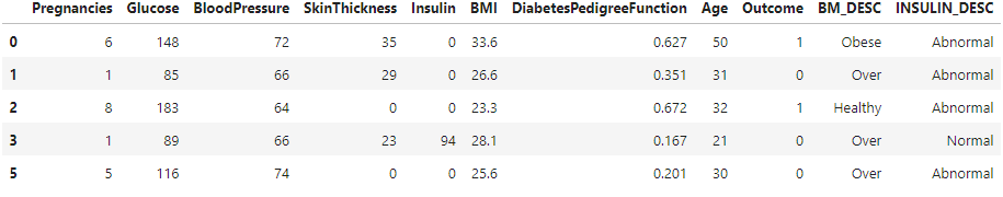
Categorizing insulin levels as "Normal" or "Abnormal" based on specific criteria. It then applies this function to each row of the DataFrame diabetes_DS2, creating a new column 'INSULIN_DESC'.
def set_insulin(row):
    if row["Insulin"] >= 16 and row["Insulin"] <= 166:
        return "Normal"
    else:
        return "Abnormal"

diabetes_DS2 = diabetes_DS2.assign(INSULIN_DESC=diabetes_DS2.apply(set_insulin, axis=1))

diabetes_DS2.head()
sns.countplot(data=diabetes_DS2, x = 'INSULIN_DESC', label='Count')

AB, NB = diabetes_DS2['INSULIN_DESC'].value_counts()
print('Number of patients Having Abnormal Insulin Levels: ',AB)
print('Number of patients Having Normal Insulin Levels: ',NB)
Number of patients Having Abnormal Insulin Levels: 435
Number of patients Having Normal Insulin Levels: 253
sns.countplot(data=diabetes_DS2, x = 'BM_DESC', label='Count')

UD,H,OV,OB = diabetes_DS2['BM_DESC'].value_counts()
print('Number of patients Having Underweight BMI Index: ',UD)
print('Number of patients Having Healthy BMI Index: ',H)
print('Number of patients Having Overweigth BMI Index: ',OV)
print('Number of patients Having Obese BMI Index: ',OB)
Number of patients Having Underweight BMI Index: 424
Number of patients Having Healthy BMI Index: 166
Number of patients Having Overweigth BMI Index: 94
Number of patients Having Obese BMI Index: 4
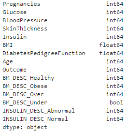
diabetes_DS2.dtypes
get_dummies function from the pandas library to perform one-hot encoding on the DataFrame diabetes_DS2. This function converts categorical variables into dummy/indicator variables, creating binary columns for each category and assigning 0 or 1 based on the presence of the category.
diabetes_DS2 = pd.get_dummies(diabetes_DS2)
pd.factorize function to convert categorical variables into numerical representations for specific columns in the DataFrame diabetes_DS2.
diabetes_DS2['BM_DESC_Healthy'] = pd.factorize(diabetes_DS2['BM_DESC_Healthy'])[0]
diabetes_DS2['BM_DESC_Obese'] = pd.factorize(diabetes_DS2['BM_DESC_Obese'])[0]
diabetes_DS2['BM_DESC_Over'] = pd.factorize(diabetes_DS2['BM_DESC_Over'])[0]
diabetes_DS2['INSULIN_DESC_Abnormal'] = pd.factorize(diabetes_DS2['INSULIN_DESC_Abnormal'])[0]
diabetes_DS2['INSULIN_DESC_Normal'] = pd.factorize(diabetes_DS2['INSULIN_DESC_Normal'])[0]
diabetes_DS2.dtypes
The new features have been added to our dataset and converted every categorical variables into numerical variables.
Train Test split
cols_drop = ['Outcome','BM_DESC_Under']
X = diabetes_DS2.drop(cols_drop,axis=1)
Y = diabetes_DS2['Outcome']
Standardizing features helps these algorithms perform more efficiently and converge faster, leading to better overall model performance.
scaler = StandardScaler()
X = scaler.fit_transform(X)
X[0:5]
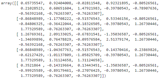
X_train, X_test, Y_train, Y_test = train_test_split(X,Y,test_size=0.2, stratify=Y, random_state=42)
print(X.shape, X_train.shape, X_test.shape)
(688, 13) (550, 13) (138, 13)
Logistic regression
Logistic regression, used with the cross-entropy cost function, is widely used in machine learning for binary classification like spam detection. Logistic regression employs the logistic function to provide probabilities between 0 and 1. The cross-entropy cost function measures dissimilarity between predicted probabilities and actual labels, facilitating accurate predictions. This combination offers a smooth, differentiable loss function, crucial for optimization methods like gradient descent. The goal is to find optimal parameters (global minimum) by iteratively adjusting them during training, enhancing the model's generalization to new data.
For a comprehensive explanation, kindly visit the following website:logistic-regression
logisticregression = LogisticRegression(max_iter=200)
logisticregression.fit(X_train,Y_train)
Expression is calculating the accuracy of the logistic regression model on the training data and presenting it as a percentage rounded to two decimal places.
round(logisticregression.score(X_train, Y_train)*100, 2)
79.09
Now, expression is calculating the accuracy on test data.
round(logisticregression.score(X_test, Y_test)*100, 2)
78.99
Quick comparison between the actual and predicted values.
Y_pred_proba = logisticregression.predict_proba(X_test)[:, 1]
Y_pred = y_pred = np.where(Y_pred_proba >= 0.5, 1, 0)
Y_test_pred = pd.DataFrame({
    'Y_test': Y_test,
    'Y_pred': Y_pred
})
Y_test_pred.head()
Confusion matrix
A confusion matrix is a table that is often used to evaluate the performance of a classification model. It compares the predicted labels of a model with the actual labels, breaking down the results into four categories:
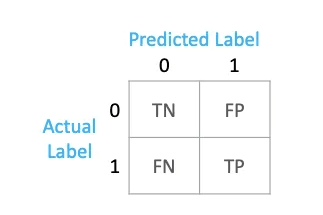
- True Positives (TP): Instances that were correctly predicted as positive. In a binary classification scenario, it means the model correctly identified the positive class.
- True Negatives (TN): Instances that were correctly predicted as negative. In a binary classification scenario, it means the model correctly identified the negative class.
- False Positives (FP): Instances that were incorrectly predicted as positive. In a binary classification scenario, it means the model predicted positive when the actual class was negative (Type I error).
- False Negatives (FN): Instances that were incorrectly predicted as negative. In a binary classification scenario, it means the model predicted negative when the actual class was positive (Type II error).
conf_matrix = confusion_matrix(Y_test, Y_pred)
conf_matrix
array([[83, 9],[20, 26]], dtype=int64)
# Plot the confusion matrix using seaborn
plt.figure(figsize=(2, 2))
sns.heatmap(conf_matrix, annot=True, fmt="d", cmap="Blues", cbar=False)
plt.title("Confusion Matrix")
plt.xlabel("Predicted")
plt.ylabel("Actual")
plt.show()
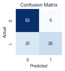
- True Negatives (TN): 83 cases where the patients actually did not have diabetes, and our model correctly predicted them as not having it.
- True Positives (TP): 26 cases where patients actually have diabetes, and our model correctly predicted them as having it.
- False Positives (FP): 9 cases where the patient actually has no diabetes, but our model incorrectly predicted that they do (Type I Error).
- False Negatives (FN): 20 cases where the patient actually has diabetes, but our model incorrectly predicted that they don't (Type II Error).
Precision, Recall, and F1-score
Precision, recall, and F1-score are important metrics in classification tasks because they provide a more nuanced evaluation of a model's performance than accuracy alone. Each of these metrics addresses specific aspects of a model's behavior, and they become particularly relevant in situations where the class distribution is imbalanced or when the cost of different types of errors varies.
Precision(Positive Predictive Value)
- Precision = TP / (TP + FP)
- Precision is the ratio of true positives to the total predicted positives. It answers the question: "Of all the instances predicted as positive, how many were actually positive?" In our diabetes prediction project, precision is approximately 74.3%. High precision is crucial in medical diagnoses to avoid unnecessary treatments or interventions.
- High Impact of False Positives: In the context of diabetes prediction, a false positive result (incorrectly predicting diabetes when it's not present) may lead to unnecessary stress, lifestyle changes, or medical interventions for individuals who are actually healthy. This can have a significant impact on the quality of life and well-being of the affected individuals.
- Reduced Trust in the Model: High false positives may also erode trust in the predictive model among both healthcare professionals and patients. If the model consistently produces false positives, healthcare providers may become hesitant to rely on its predictions, potentially leading to a lack of adoption.
Recall (Sensitivity or True Positive Rate)
- Recall = TP / (TP + FN)
- Recall is the ratio of true positives to the total actual positives. It answers the question: "Of all the actual positive instances, how many were correctly predicted?" In our diabetes prediction project, recall is approximately 56.5%. Recall becomes critical in medical diagnoses where missing a positive case may have severe implications.
- High Impact of False Negatives: In diabetes prediction, a false negative result (missing a case of diabetes) can have serious consequences. Undetected diabetes may lead to delayed treatment, allowing the condition to progress unchecked, potentially resulting in complications such as cardiovascular disease, kidney damage, or nerve damage.
F1-score
- F1-score = 2 * (Precision * Recall) / (Precision + Recall)
- The F1-score is the harmonic mean of precision and recall. It provides a balanced measure that considers both false positives and false negatives. F1-score is useful when there is a need to balance precision and recall. It is especially relevant when there is an imbalance in the class distribution, and it helps in scenarios where both false positives and false negatives have significant consequences.
- A good F1-score depends on the specific requirements and priorities of the project or application. Generally, an F1-score closer to 1 indicates a good balance between precision and recall, whereas an F1-score closer to 0 suggests an imbalance or poor performance in one of the metrics.
- In the context of a diabetes prediction project with an F1-score of approximately 0.644, it can be considered decent.
print(classification_report(Y_test, Y_pred))
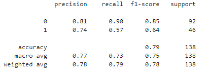
Let's calculate precision, recall, and F1-score for both classes (0 and 1)
- Precision for Class 0:
- Precision for Class 0 = negative predictive value (NPV)
- Recall for Class 0:
- Recall for Class 0 = specificity, selectivity or true negative rate (TNR)
- F1-score for Class 0:
- Precision for Class 1:
- Precision for Class 1 = precision or positive predictive value (PPV)
- Recall for Class 1:
- Recall for Class 1 = sensitivity, recall, hit rate, or true positive rate (TPR)
- F1-score for Class 1:
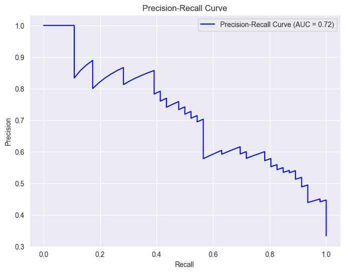
# Calculate precision-recall curve
precision_curve, recall_curve, _ = precision_recall_curve(Y_test, Y_pred_proba)
Calculates the area under the precision-recall curve (AUC-PR), providing a quantitative measure of how well our model performs across different trade-offs between precision and recall. A higher AUC-PR generally indicates better model performance.
# Plot precision-recall curve
area_under_curve = auc(recall_curve, precision_curve)
plt.figure(figsize=(8, 6))
plt.plot(recall_curve, precision_curve, label=f'Precision-Recall Curve (AUC = {area_under_curve:.2f})', color='b')
plt.xlabel('Recall')
plt.ylabel('Precision')
plt.title('Precision-Recall Curve')
plt.legend()
plt.grid(True)
plt.show()
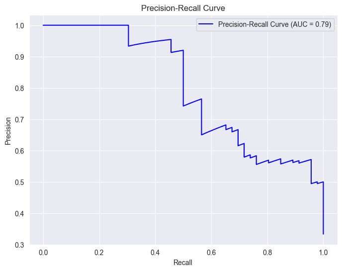
In the context of a diabetes prediction project, precision and recall curves are like guides showing how well our model is making predictions. Imagine precision as a measure of how accurate our positive predictions are, and recall as a measure of how many actual positive cases our model captures.
Starting Point (0, 0):
- At the origin (0, 0), the recall is 0, indicating that no positive cases are being correctly identified. This means the model is essentially classifying everything as negative.
- At this point, precision is undefined or can be considered 1.0 (depending on the implementation). This is because there are no true positives (TP) and no false positives (FP), so the precision formula (TP / (TP + FP)) results in a division by zero.
Movement along the Curve:
- As you move along the curve towards (1, 1), recall increases. This means the model is correctly identifying more positive cases.
- However, precision generally decreases. This is because, as the model becomes more sensitive to positive cases, it also tends to include more false positives, lowering the precision.
Trade-off:
- The precision-recall curve illustrates the inherent trade-off between these two metrics. You often need to find a balance between capturing as many positive cases as possible (high recall) while maintaining a reasonable level of accuracy in your positive predictions (high precision).
Area Under the Curve (AUC):
- The AUC-PR (Area Under the Precision-Recall Curve) is a summary metric that captures the overall performance of a model across different thresholds.
- A higher AUC-PR generally indicates better performance, with an ideal value of 1.0.
- In the provided image, the AUC-PR is 0.79, suggesting a reasonably good performance, but there might be room for improvement.
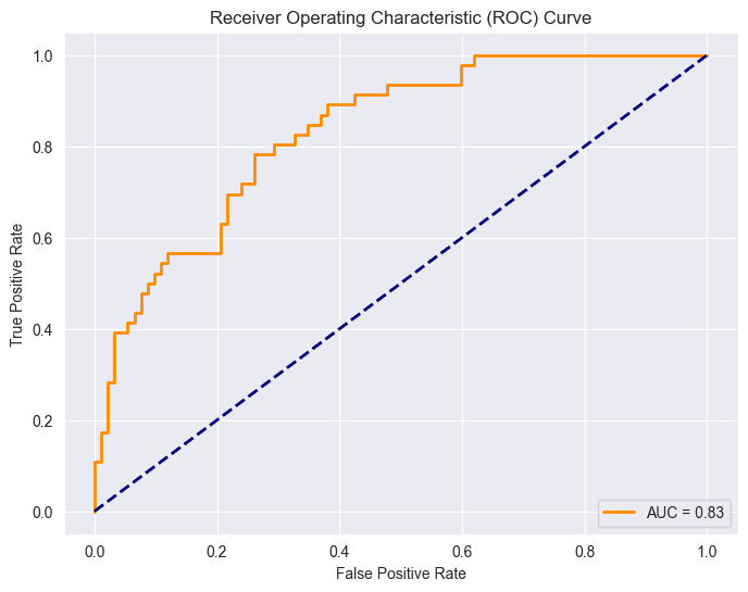
Receiver Operating Characteristic (ROC)
The Receiver Operating Characteristic (ROC) curve is a graphical representation of the performance of a binary classification model at various classification thresholds. The ROC curve is created by plotting the true positive rate (sensitivity) against the false positive rate (1-specificity) for different threshold values.
Particularly useful when class distribution is balanced and the costs associated with false positives and false negatives are similar. However, it's important to be aware of the optimism bias that can arise, particularly when the number of actual negatives is large. This bias stems from the fact that the false positive rate (FPR) can become very small in such cases, even with a large number of false positives. Consequently, the ROC curve may exhibit a high Area Under the Curve (AUC), which might not accurately reflect the practical utility of the model.
As mentioned earlier, having a balanced class distribution is important for this ROC, but unfortunately, we don't have it. However, I still decided to implement it because it will give us insights into the relationship between ROC and precision and recall. Interestingly, I haven't utilized ROC in any previous projects, but doing so has actually enhanced my understanding of the concept.
False Positive Rate (FPR):
- FPR = FP / ( FP + TN )
- This formula represents the ratio of cases where the model incorrectly predicts positive (diabetes) among those who actually do not have diabetes.
True Negative Rate (TNR) or Specificity:
- TNR = TN / ( TN + FP )
- This formula calculates the ratio of cases where the model correctly predicts negative (no diabetes) among those who actually do not have diabetes.
Relationship Between Specificity and False Positive Rate:
- FPR = 1 − TNR
- This equation illustrates the relationship between Specificity (True Negative Rate) and False Positive Rate. It emphasizes that the Specificity is complementary to the False Positive Rate. As Specificity increases, meaning the model becomes better at correctly identifying individuals without diabetes, the False Positive Rate decreases.
Sensitivity
- sensitivity = recall, true positive rate (TPR)
fpr, tpr, _ = roc_curve(Y_test, Y_pred_proba)
roc_auc = roc_auc_score(Y_test, Y_pred_proba)
plt.figure(figsize=(8, 6))
plt.plot(fpr, tpr, color='darkorange', lw=2, label=f'AUC = {roc_auc:.2f}')
plt.plot([0, 1], [0, 1], color='navy', lw=2, linestyle='--')
plt.xlabel('False Positive Rate')
plt.ylabel('True Positive Rate')
plt.title('Receiver Operating Characteristic (ROC) Curve')
plt.legend(loc='lower right')
plt.show()
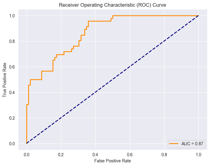
Point (0,0): This point corresponds to a threshold where the model classifies all instances as the negative class. At this threshold, both the True Positive Rate (sensitivity) and False Positive Rate are zero.
This situation indicates that the model doesn't identify any true positives (individuals with diabetes) but also avoids false positives (incorrectly classifying non-diabetic individuals as diabetic).
Point (1,1): This point corresponds to a threshold where the model classifies all instances as the positive class. At this threshold, both the True Positive Rate (sensitivity) and False Positive Rate one.
This scenario implies that the model identifies all true positives (individuals with diabetes) but also incorrectly classifies all non-diabetic individuals as having diabetes (false positives).
The diagonal line in the ROC space, represented by the line connecting (0,0) to (1,1), represents the performance of a random classifier. Points above this line indicate better-than-random performance, while points below suggest a worse-than-random classifier. In an ideal case, the ROC curve would be far from the diagonal, showing a clear separation between positive and negative instances.
The Area Under the ROC Curve (AUC-ROC) is given as 0.87.
MLP model with tensorflow
If you are curious and want to understand the fundamentals behind the neural network of a multilayered perceptron please visit my article on the given link Artificial Neural Network.
Our TensorFlow custom MLP model will produce varying results in each run due to the random initialization of weights and the stochastic nature of optimization algorithms. Additionally, our model may not perform well because of the limited data available in our project.
model = tf.keras.Sequential([
    tf.keras.layers.Dense(32, activation='relu', input_shape=(13,)),
    tf.keras.layers.Dense(16, activation='relu'),
    tf.keras.layers.Dense(8, activation='relu'),
    tf.keras.layers.Dense(1, activation='sigmoid')
])
# Compile the model
model.compile(optimizer=tf.keras.optimizers.Adam(learning_rate=0.0002),
              loss='binary_crossentropy',
              metrics=['accuracy' , tf.keras.metrics.AUC()])

# Print the model summary
model.summary()
history = model.fit(X_train, Y_train, epochs=100 , batch_size=10, validation_split=0.2)
# Evaluate the model on the test set
test_loss, test_accuracy, test_auc = model.evaluate(X_test , Y_test)
print(f'\nTest Accuracy: {test_accuracy * 100:.2f}%')
print(f'Test AUC: {test_auc:.4f}')
Test Accuracy: 77.54% Test AUC: 0.8327
 # Predict probabilities on the test set
Y_pred_proba  = model.predict(X_test )
y_pred = np.where(Y_pred_proba >= 0.5, 1, 0)
conf_matrix = confusion_matrix(Y_test, y_pred)
# Plot the confusion matrix using seaborn
plt.figure(figsize=(2, 2))
sns.heatmap(conf_matrix, annot=True, fmt="d", cmap="Blues", cbar=False)
plt.title("Confusion Matrix")
plt.xlabel("Predicted")
plt.ylabel("Actual")
plt.show()

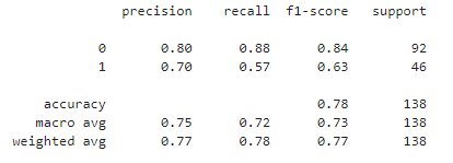
print(classification_report(Y_test, y_pred))
# Calculate precision-recall curve
precision_curve, recall_curve, _ = precision_recall_curve(Y_test, Y_pred_proba)
# Plot precision-recall curve
area_under_curve = auc(recall_curve, precision_curve)
plt.figure(figsize=(8, 6))
plt.plot(recall_curve, precision_curve, label=f'Precision-Recall Curve (AUC = {area_under_curve:.2f})', color='b')
plt.xlabel('Recall')
plt.ylabel('Precision')
plt.title('Precision-Recall Curve')
plt.legend()
plt.grid(True)
plt.show()
fpr, tpr, _ = roc_curve(Y_test, Y_pred_proba)
roc_auc = auc(fpr, tpr)
# Plot ROC curve
plt.figure(figsize=(8, 6))
plt.plot(fpr, tpr, color='darkorange', lw=2, label=f'AUC = {roc_auc:.2f}')
plt.plot([0, 1], [0, 1], color='navy', lw=2, linestyle='--')
plt.xlabel('False Positive Rate')
plt.ylabel('True Positive Rate')
plt.title('Receiver Operating Characteristic (ROC) Curve')
plt.legend(loc='lower right')
Logistic regression is doing better than MLP. This implies that logistic regression is the preferred choice when dealing with a small dataset.